Why a Contour Line Can Make a Form Feel Solid
Learn how a contour line gives a drawn form a readable boundary, and use subtle shifts in line weight to suggest turning without interior detail.
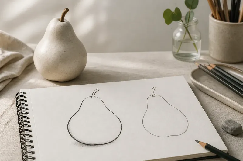
Why does a simple outline make a drawn pear feel solid while another looks like a flat symbol? A contour line gives the eye a boundary to follow; small changes in its weight can suggest where the surface turns, even when the inside is left blank.
What does a contour line tell the eye?
A contour marks where a form meets its surroundings. It separates the object from the paper, much as the edge of a plate separates its rim from a tablecloth. The eye can follow that boundary and infer a shape beyond the line itself.
This is not merely a matter of tracing what you see. A useful contour selects which edges matter. On a mug, the outer curve, handle and lip may establish the object more clearly than a collection of small decorative marks. If the line wanders or breaks in an unhelpful place, the form may seem uncertain even when its general shape is recognisable.
A contour also implies continuity. A stroke that travels around a rounded object invites the eye to imagine a surface passing behind it. The line does not need to show every change in that surface; it needs to make the boundary coherent enough for the viewer to supply what is missing.
How can one line suggest a turning surface?
Line weight gives a contour a sense of emphasis. A slightly heavier segment can make an edge feel nearer or more decisive, while a lighter segment can let the boundary recede. The shift need not be dramatic. If every part of an outline is equally dark and thick, the form can feel cut out, like a shape trimmed from card.
Think of a contour as a route rather than a fence. The pencil does not have to press equally hard along the whole route. Where the form turns away from the viewer, a lighter touch can keep that edge from competing with the part that faces forward. Where two rounded planes meet or overlap, a firmer mark can clarify the change in direction.
These choices work best when they follow what the form is doing. On a sphere, a change in line weight may help distinguish the near edge from the edge that feels less present. On a folded leaf, a brief accent at a sharp bend can make the turn legible. The line is not describing a cast shadow; it is controlling how strongly the boundary announces itself.
Where should the contour become heavier or lighter?
Begin by looking for places where the outline changes direction, approaches another edge, or passes behind an overlapping part. These are points where a small weight shift can clarify the form. Keep the rest of the contour comparatively calm, so the accents have somewhere to register.
- At a turn: Give a short section more weight if it helps the surface change direction read clearly.
- At an overlap: Strengthen the edge of the form that sits in front and soften the edge that continues behind it.
- Along a broad curve: Let the line breathe rather than darkening the entire arc; an even heavy outline can flatten the shape.
- Near a narrow point: Keep the mark controlled, since a blunt, dark junction can make a delicate form look pinched.
- At a disappearing edge: Allow the contour to thin or pause if the boundary is visually weak, rather than forcing an unbroken black border.
These are drawing choices, not rules tied to a particular object. A close, forceful contour can be right for a graphic illustration; a quieter one may suit a light observational sketch. The question is whether the change helps the viewer read the form, not whether it follows a universal map.
Why can a continuous contour feel more solid than interior detail?
Interior marks describe things happening on a surface: a vein in a leaf, a crease in fabric, or a highlight on a cheek. They can add useful information, but they do not necessarily explain where the object ends. The contour does that job directly, so a clear boundary can carry the drawing before any interior detail is added.
Too many internal marks can also compete with the outline. A leaf filled with veins but enclosed by a hesitant boundary may read as a pattern rather than a leaf. Conversely, a confident, well-shaped contour can make a blank interior feel intentional. It gives the viewer enough information to recognise a volume without spelling out every surface feature.
This does not mean that interiors should always be empty. It means they have a different task. A contour establishes the outer form; interior lines can then explain its construction, texture or markings. Keeping those roles distinct makes it easier to see which mark is solving which problem.
What should you check when a contour looks flat?
Ask these questions before adding shading or extra detail:
Is the boundary easy to follow?
Look for accidental gaps, tangles or abrupt changes that do not correspond to a turn or overlap. A short, purposeful break can be expressive, but an unclear break may stop the eye from understanding where the form continues.
Does the line weight change for a reason?
Check whether darker sections correspond to a useful visual emphasis, such as a near edge or an overlap. If the outline grows heavier wherever the pencil happens to pause, the weight shifts may distract rather than describe.
Are the interior marks doing a separate job?
Temporarily ignore them and see whether the outside shape still reads. If it does not, revisit the contour before building more detail; added marks can make a drawing busier without making its form clearer.
Does the outline describe the object, or merely surround it?
Notice whether the curves and corners follow the object’s actual changes of direction. A generic enclosing loop may identify a broad category, but a more particular contour helps the viewer understand the object’s structure.
How can you practise contour weight without adding detail?
Say you are drawing an invented, hypothetical ceramic pear from observation, with its broad base resting on a table and its narrow neck turning slightly away. Start with one light contour, keeping the inside blank. Once the outer shape feels clear, darken a short section where the base turns towards the viewer and let the line grow lighter as it travels around the receding neck. The expected observable result is a boundary that feels less uniform, with the upper form appearing to turn without a drawn patch of shading.
For another pass, keep the weight nearly even and compare the two drawings from a little distance. Look for whether the first version’s emphasis helps the pear feel rounded, or merely makes one edge louder. If the change distracts, soften it. A useful line-weight shift is often modest enough to notice in the drawing but not so strong that it becomes the subject.
Contour drawing is not a contest to make every edge continuous or every accent persuasive. The practical aim is a boundary the eye can follow and a few considered shifts that explain how the surface turns. When the contour has done those jobs, blank paper inside the shape is not missing information; it is room for the form to hold together.