The Quiet Geometry of the Picture Frame
Picture framing in drawing directs attention through edges, margins and crops, helping you choose between a contained arrangement and a scene that continues beyond the page.
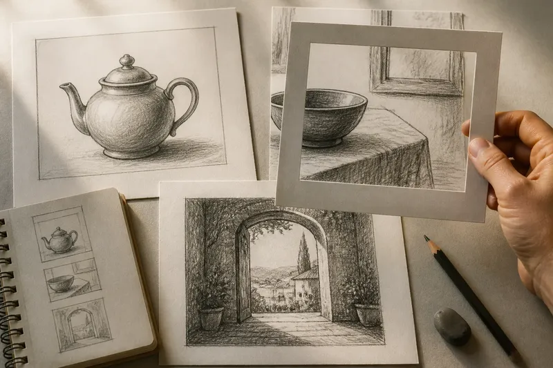
Picture framing in drawing begins with a plain decision: what happens at the edge of the page? A hand, roofline or tree can stop neatly inside the border, touch it, or disappear beyond it. Each choice changes what the viewer notices and how much of the unseen scene they imagine.
The frame is not merely a boundary around a finished picture. It is part of the composition: a set of limits that can make an arrangement feel settled, compressed, open or interrupted. Three useful approaches are the carefully contained image, the deliberate crop and the frame-within-a-frame. None is automatically more expressive. The right one depends on what the picture needs the viewer to attend to.
What does a contained composition do?
A contained composition keeps its important forms comfortably within the picture boundary. Objects have room around them; their silhouettes are not accidentally clipped; the main action can be read without reconstructing missing parts. This approach suits subjects whose character depends on their whole shape, such as a single vessel, a standing figure or a carefully arranged group of objects.
That breathing room is not empty by default. It can give a form a sense of isolation, stillness or importance. A teapot drawn with space around its handle is easier to read as a complete object than one whose handle is nearly lost against the page edge. The surrounding paper acts like a quiet margin in a book: it lets the central matter sit without being crowded.
To plan a contained image, lightly mark the intended picture area, then place the largest shape before adding small details. Check the gaps between the subject and each edge. If one margin feels much tighter than the others, decide whether that imbalance is deliberate; if not, shift the drawing or revise the boundary. A faint rectangle in graphite is often enough. A ruler can help establish a clean panel, though a freehand border may better suit a loose drawing.
This approach often suits beginners and illustrators working with objects that need to remain recognisable. It is also useful when a drawing must sit within a page layout, where a clear silhouette and predictable margins make later placement easier. Its risk is excessive politeness: if every form is safely centred and fully visible, the scene may feel arranged rather than observed.
When should you crop through a subject?
A crop allows a form to cross the picture boundary. A shoulder may enter from one side; a branch may vanish at the top; a table may continue beyond the bottom edge. The viewer sees enough to infer the larger whole, while the missing part gives the composition a sense of continuation. This can make a modest subject feel close, immediate or in motion.
For a crop to feel intentional, the boundary should cut through a form with purpose. A line that barely kisses the edge can look like a near miss. A shape clipped at a decisive point is usually easier to read. Look at the direction of the remaining contour and ask whether it suggests a plausible continuation beyond the page. The crop need not reveal exactly what lies outside; it should make the omission feel chosen.
Say you are drawing a kitchen table with a bowl near one corner. If the bowl is fully visible but the table edge runs out of the frame, the viewer may read the table as extending into the room. If the bowl itself is cut in half, the image shifts towards a closer, more immediate view. The observable difference is where attention settles: on the setting in the first version, and on the bowl’s form in the second.
Use cropping when proximity, movement or a larger off-page environment matters more than a complete inventory of the subject. It can suit street scenes, interiors and figures in action. It is less helpful when the viewer must understand the whole object or when the cut obscures a feature needed to identify it. Before committing, make small thumbnail sketches with the same subject placed at different edges. The change in emphasis is easier to judge at a glance than through repeated erasing on a detailed drawing.
Can a second frame organise the scene?
A frame within the picture uses one visible boundary to shape another: a doorway around a figure, a window around a distant roof, or an arch that holds a garden beyond it. The inner frame gives the eye a route into the image and separates one area from another without requiring a drawn box around every subject.
This approach suits scenes with a natural opening or strong architectural structure. It can also give a small focal subject a clear setting. The outer composition establishes the whole page; the doorway or window then offers a smaller, more concentrated view. A strong inner boundary may feel orderly, while a partial one can suggest that the viewer is looking from a particular position rather than inspecting a diagram.
Take care that the inner frame does not become a second subject by accident. If a dark window surround is more prominent than the landscape beyond it, the viewer may attend to the surround first. That can be useful when the act of looking is part of the picture. If the distant view matters more, keep the frame’s contrast quieter and let its edges lead towards the focal area.
How do line, tone and margin change the edge?
The picture boundary is not always a visible drawn line. It may be the edge of the paper, a ruled panel, a block of colour or a broad tonal shape. Each makes a different promise. A firm ink border declares a designed enclosure; an unmarked paper edge leaves the boundary present but less emphatic. A narrow margin can make the image feel tightly held, while a generous one gives the subject more visual quiet.
Line weight and tone also affect how strongly a form meets the edge. A pale contour that fades near the border may feel less conclusive than a dark line cut cleanly by it. If the subject is meant to continue, keep the cropped contour legible enough to imply its direction. If the picture should feel contained, avoid letting high-contrast marks accidentally drag the eye out of the frame.
In pencil, a light boundary can be tried and altered before it is reinforced. In pen or brush, small studies are useful because a heavy edge is difficult to soften afterwards. Cropping can also be explored with a paper window: cut a rectangle from spare card and move it over a drawing or reference view. The window changes the visible composition without changing the underlying marks, much like moving a frame on a wall to see which part of a room it holds.
How should you choose a picture frame for a drawing?
Should I keep the whole subject inside the page?
Choose containment when the whole silhouette or its relationship to nearby objects is essential. Leave enough surrounding paper for the shape to read clearly, then check that the margins support the intended mood rather than merely looking even.
When does a crop look accidental?
A crop can look accidental when a contour barely touches the border or when the cut hides a feature needed to identify the subject. Try a more decisive cut or pull the form farther inside, then compare the two small versions.
Is a drawn border always necessary?
No. The paper edge already frames the picture, and a separate border adds emphasis that may or may not help. Add one when a panel, print-like image or designed enclosure suits the work; leave it out when the subject needs to feel open.
What should I test before adding detail?
Make a few small thumbnails and compare the subject’s position, the main gaps and the points where forms meet the edge. Decide which version gives the clearest emphasis, then develop that arrangement rather than polishing every possibility.
Which approach fits the picture you want?
Choose the contained composition when completeness and calm matter. Choose cropping when the scene should feel close, active or larger than the page. Use a frame within a frame when an opening can organise the view or direct attention towards a distant subject.
These options can be combined, but each should have a clear job. A doorway may contain the distant landscape while a foreground figure is cropped by the outer edge. The contrast then distinguishes the two kinds of looking: a view held within architecture and a nearby presence that continues outside it.
For a final check, cover the drawing’s edges with your hands or a card window and reveal them again. Notice where your eye enters, where it rests and whether any clipped shape seems to continue convincingly. Picture framing in drawing is most useful when the boundary makes a quiet, specific choice on the artist’s behalf. The edge need not explain the whole scene; it only needs to make the visible part feel deliberately selected.